

 Did you realize that over 90 percent of the information we receive is through our eyes? Did you know that the paint color of a room can affect your perception of that room?
- RED makes a room appear smaller, but it comes into its own when set against cool colors (blue and green).
- ORANGE also makes a room appear smaller but it is less oppressive than red. Best used to decorate welcoming parts of the home.
- YELLOW can brighten small rooms, however a bright yellow is not recommended for children’s rooms as it has a vibrating intensity.
- GREEN does well when used with contrasting colors or several shades of green, rather than all one shade. It is a good color for a bedroom as it promotes relaxation.
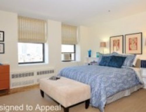
- BLUE that is pale will make a space feel light and airy. Darker tones make the space more relaxing, as in a bedroom, but if too dark, it can make the room depressing. Bright blues are good for children’s rooms.
- VIOLET or PURPLE should be used sparingly to maintain its effect of mystery, elegance and luxury.
- WHITE used on all walls can be stark, cold and reflects too much light and glare. It is best to use an off-white, pale cream or beige.
Did you realize that color can also drastically affect your mood?
- RED stimulates our appetite and energizes us.
- ORANGE inspires fun and laughter and lifts the spirit.
- YELLOW stimulates and energizes the mind, benefits our memories, and maintains our positive frame of mind.
- GREEN makes us feel tranquil, relaxed and rested.
- BLUE calms us, helps us meditate, and fosters clear thinking.
- VIOLET or PURPLE stimulates our senses and minds, promotes creativity and romance, but also can sedate us.
- WHITE used on all walls can overstimulate the nervous system, making us feel tired and irritable.
Do you have any experiences of how paint color changed your perception of a room or your mood?

